Monday, April 30, 2007

a little toile goes a long way

I was in Michael's over the weekend with some friends, primarily to look at the new Martha Stewart products, but also to scavenge through the $1 bins. I like Martha's products - her color palette has always been very pleasing to me, so we purchased some of the paper (and split it up so that we each got at least one of each color).
I was intrigued, so the next day I ventured out to another Michael's, a little further away. I scored big on the clear $1 stamps, and while I was walking around the discount bins, something caught my eye.

In an otherwise empty $1 bin, sat two round buttons. I reached in to get a better look and ....oh no........toile.

Why "oh no" you ask? Well, I don't care for toile...so why were these button calling to me? I found them very pretty. BUT I don't like toile. I stood there thinking....then it hit me.

I don't like toile because whenever I see a room done in toile.....well the ROOM is DONE in toile!!. Toile overload!! The wallpaper, bedspread, curtains, pillows, upholstrey. I get toile vertigo when I see something like that.

A little toile goes a long way.

I realized with this one little button, I would create a simple card with the button as the focal point. My little creation is below. And guess what....I love the little toile scene.


(Martha Stewart paper (swan color), cuttlebug EF (textile), stamp by Fiskars, misc ribbon and a $1 toile button)


Saturday, April 28, 2007

Take Ten Design Challenge

The Sring issue of Take Ten magazine Issued a challenge to all readers to submit cards using their design sketch on page 25 of that issue. I've participated in their challenges before and have had cards published, so I thought I would try again. Their deadline is May 1 - here are my submissions.
Martini: stamps from Autumn Leaves (Swirls) and Vap! Scrap (martini), background paper from Provo Craft
Lighthouse: stamps from SU (crosshatch) , PSX (lighthouse) and ERA Graphics (Dream); colorwash sprays from Stamp Zia
Car: unknown stamp, cuttlebug embossing folder

Wednesday, April 25, 2007

Cut away


This month we tried another technique - cutting away at part of an image to allow the background paper to show through. Alice showed us this technique using a butterfly image and this is my take.....I started with a piece of glossy card stock that I had previously colored using reinkers and water. I embossed the dragonfly images (company unknown for the larger ones, SU for the small) and stamped the cattails (Stampscapes). Using an exacto knife, I cut away at the larger dragonfly wings, to allow the blue card stock to show through. The purple background is stamped with canvas (SU), along with swirls and flowers (Autumn Leaves). The "imagine" embellishment is from Making Memories and is mounted on an oval die cut from sizzix.

Tuesday, April 24, 2007

Photo Tinting


We had a great meeting of our stamp group this month!! Four different techniques!! Here is my take on one of them, photo tinting. Sherry showed us this technique, where she took a black and white photo and used pastel chalks and a stencil brush to rub color on certain parts of the picture. Now, I know that there are special pens and inks to do this technique, but not having those supplies I used what I have. I took this photo from my photo editing software (Printshop), changed it to black and white and printed it on glossy photo paper. Then I used Ancient Page inks and a makeup sponge to apply green to the leaf and pink to the flower. On my first attempt I used too much pink, so I tried again and this time the pink is more subtle.

For the sentiment (from Impress) I stamped using Staz On opaque cotton white. I have had limitied sucess with this color. It never seems white enough for me...so I used my white signa pen and wrote over the stamped image.

Wednesday, April 18, 2007

more tri fold....


Another tri fold - cami style. Some time ago I purchased a set of bicycle stamps from Sunday International and have been trying to figure out some way to incorporate them into my cards. While doing these tri fold cards, I began to search through my stash of smaller stamps, ones that would fit in the small window of the tri fold and came across the bicycle stamps. This stamp is just so cute that I will have to find other ways to use it. The paper and ribbon are from SU and the flower is a prima.

Monday, April 16, 2007

Prima's!!


I finally found Prima's at our local Target store!! This is my first creation using these pretty flowers. I started with a red card base and matched the orange prima with a sheet of Basic Grey paper from the Romanii collection. I wanted to have the sentiment (Stampin Up) peek through an oval shape, but just punching one oval did not seem right, so I did a double punch to allow a piece of orange card stock to show through. I layered a smaller white prima over the larger orange flower and found a matching brad to hold them together.

Sunday, April 15, 2007

It's been awhile


Yes, I've not posted in awhile - been busy creating some cards to be submitted for publication. I'll post the creations once the deadline for submission has passed. In the meantime, more watercolor!! I love these easy to use colorwash sprays from Stamp Zia - the colors are so vibrant. All the stamps used are also from Stamp Zia.

Friday, April 6, 2007

Tri fold card


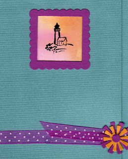
Here is my take on the TriFold card technique from last weeks SCS challenge. I started with textured cardstock from WalMart (A stack of 48 sheets of 12 x 12 paper - a great buy at just under $10 - must get more of these) and used my Marvy punches to make the window and frame. The little lighthouse stamp is from PSX. I had stamped this image several times on some background paper made using Posh reinkers on glossy spritzed with water. The images sat in a box for over a year when I realized they were just the right size for this card. The flowers are from a sizzix die cut, the ribbon from Hobby Lobby.

Thursday, April 5, 2007

hello again


Yes, it's been a while since my last post, but we had family visiting from Chicago and were busy "offline"!

Now for the latest creation...I'm doing more experimenting with watercoloring - just love the look. This card started with Buckaroo Blue cardstock on which I stamped the Swirls set from Rhonna Farrer - this is just a wonderful set I picked up at Target for less than $10. I used a white gel pen to accent portions of the swirls. For the main images, I used Strathmore 80lb watercolor paper. The images were stamped with black Staz on then colored with Coral and Banana reinkers mixed with Winsor & Newton blending medium for watercolor. I used about three layers of colors, building up the intensity as I went on. A light wash of banana was also applied in the background. I would use a heavier weight paper next time as the 80 lb is a little thinner than what I am used to, and less blending medium as it diluted the colors more than I had expected. I mounted the images on Coral, then Banana and added a ribbon from Hobby Lobby.
(stamps by Stampin up, Rhonna Farrer)